Time-Tracking App
Upgrade Campaign (Spec)
Going from a free to a paid subscription is a lot to ask for. But persuasive copy makes it feel natural, not pushy.
Landing pages with a big ask (like buying, upgrading from free to paid, etc.) require a lot of convincing. But things like relevant information about your product and a strong understanding of your audience’s needs/pain points aren’t enough. You also need a clear brand voice and actionable copy.
For a landing page with a big ask, I prioritize clarity and urgency. Rather than settle for desperate fear-based sales tactics, I rely on your customers’ needs and your product’s features/benefits.
Overview & Goals
- Convert free users into paid subscribers
- Emphasize feature gaps between free and paid
- Target a specific segment of the audience
- Increase perceived ROI of a paid plan
I would focus on...
- The SaaS product's features/benefits
- Audience questions & pain points
- Emotions like urgency, FOMO, comparison, etc.
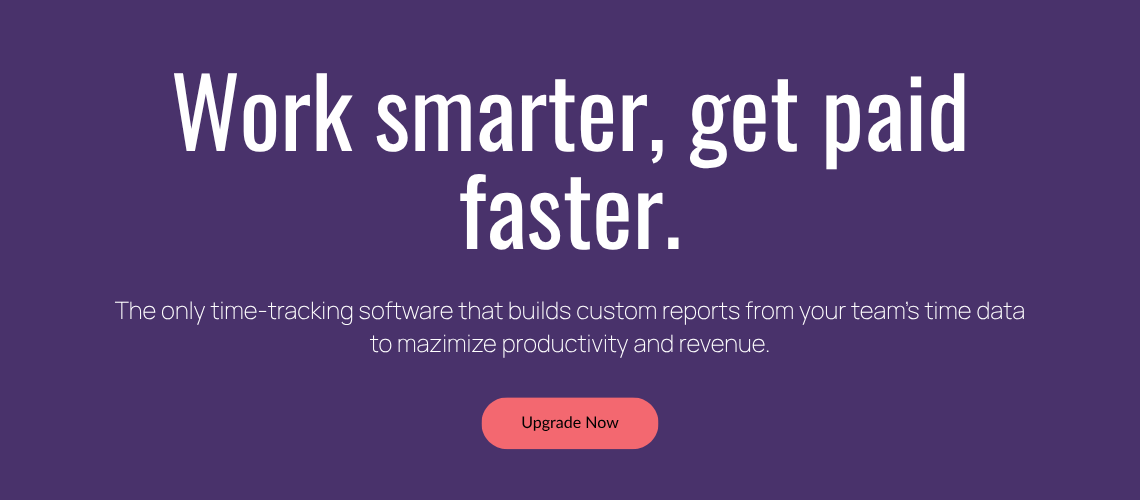
Section 1 - Hero Section
Grab attention & summarize the value of upgrading.
Headline options
- The Value Prop (more results-focused)
- The CTA (reveal your offer upfront)
- The Superlative (what the product is best at)
Subheading options
Subheadings aren’t required, but they’re great for adding extra details without sounding too long-winded.
Click here to view the full landing page.
One CTA or two?
It depends. For branding campaigns, one is ideal, since you’re not pushing a big ask (like a sale or free trial).
Does there HAVE to be a CTA?
Not necessarily, but it’s very common. Even if users don’t click on it, a CTA button in the hero section clues them in on what you want them to do in the end. Since upgrading is a big ask, it may be better to save the CTA button for a later section of the landing page.
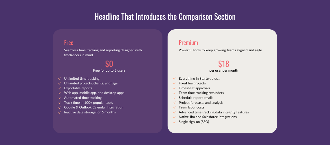
Section 2 - Comparison
Help users visualize what's in store for them when they upgrade.
Headline options
- The Agitator (highlighting a pain point + rubbing it in)
- The Value Prop (more results-focused)
- The Superlative (what the client is best at)
- The CTA (reveal your offer upfront)
Layout options
Lorem ipsum dolor sit amet, consectetur adipisicing elit, sed do eiusmod tempor incididunt ut labore et dolore magna aliqua. Ut enim ad minim veniam, quis nostrud exercitation ullamco laboris nisi ut aliquip ex ea commodo consequat. Duis aute irure dolor in reprehenderit in voluptate velit esse cillum dolore eu fugiat nulla pariatur.
Click here to view the full landing page.
What if my tool has multiple pricing options?
Lorem ipsum dolor sit amet, consectetur adipiscing elit. Ut elit tellus, luctus nec ullamcorper mattis, pulvinar dapibus leo.
How do you know which features to include or not include?
Lorem ipsum dolor sit amet, consectetur adipiscing elit. Ut elit tellus, luctus nec ullamcorper mattis, pulvinar dapibus leo.
Section 3 - Call to Action (CTA)
Don't leave your readers hanging. Guide them to the next step.
Headline options
- The Agitator (highlighting a pain point + rubbing it in)
- The Value Prop (more results-focused)
- The Superlative (what the client is best at)
- The CTA (reveal your offer upfront)
Subheading? Body text?
Lorem ipsum dolor sit amet, consectetur adipisicing elit, sed do eiusmod tempor incididunt ut labore et dolore magna aliqua. Ut enim ad minim veniam, quis nostrud exercitation ullamco laboris nisi ut aliquip ex ea commodo consequat. Duis aute irure dolor in reprehenderit in voluptate velit esse cillum dolore eu fugiat nulla pariatur.
Click here to view the full landing page.
Long or short button text?
Lorem ipsum dolor sit amet, consectetur adipiscing elit. Ut elit tellus, luctus nec ullamcorper mattis, pulvinar dapibus leo.
What if they still don't want to upgrade?
Lorem ipsum dolor sit amet, consectetur adipiscing elit. Ut elit tellus, luctus nec ullamcorper mattis, pulvinar dapibus leo.